
Designing Qaren, an app for comparing insurance offers side by side
An app that shows insurance offers from several providers in one place, so the user can compare them side by side. The challenge was keeping the comparison clear when cover and terms differ from one offer to the next.
01The challenge
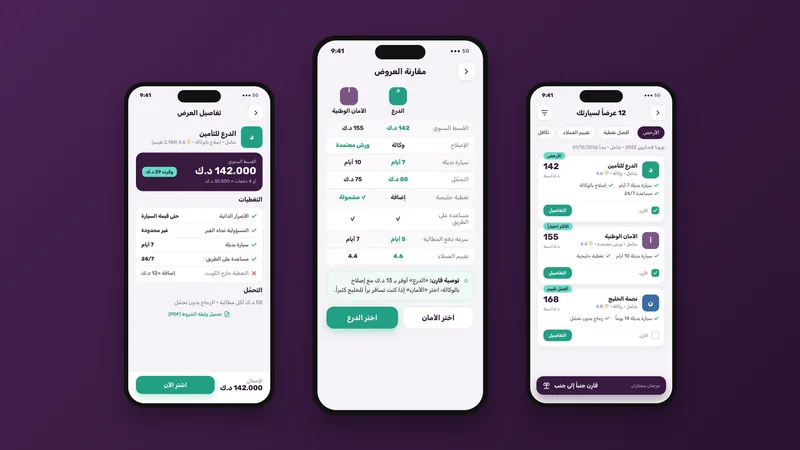
Offers side by side, on one screen.
An app that shows insurance offers from several providers in one place, so the user can compare them side by side. The challenge was keeping the comparison clear when cover and terms differ from one offer to the next.
02Scope and our team’s role
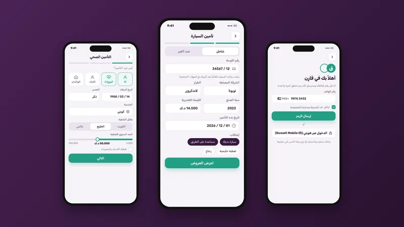
From choosing the type of insurance to the comparison.
- 01Sign-in, and home with the types of insurance
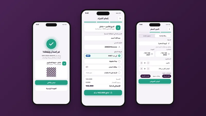
- 02The car, health and travel forms
- 03The list of offers and each offer’s details
- 04Comparing offers side by side
- 05Checkout, documents and renewals
- 06Chatting with an adviser, and Account
03How we delivered it
A comparison table read at a glance.
Our team made the comparison the heart of the app: the user enters their details once, the offers appear in a list they can sort as they like, then two offers sit in one table that brings out the differences line by line. All names, numbers and brands in the screens are illustrative.
04Who worked on the project
The team
- User experience and UI designRyplaced Work
05The final work
The screens as our team designed them, in Arabic.
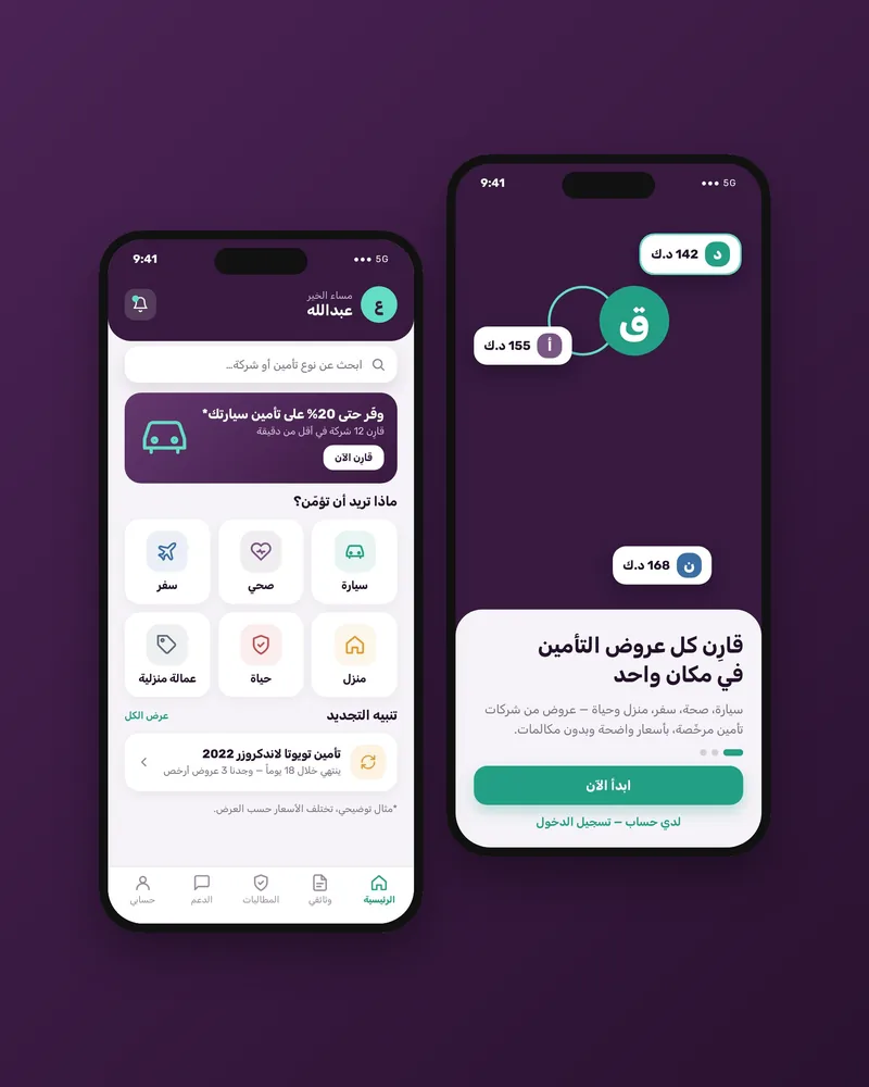
Splash and home Sign-in, the car details and health insurance Travel insurance, checkout and the confirmation 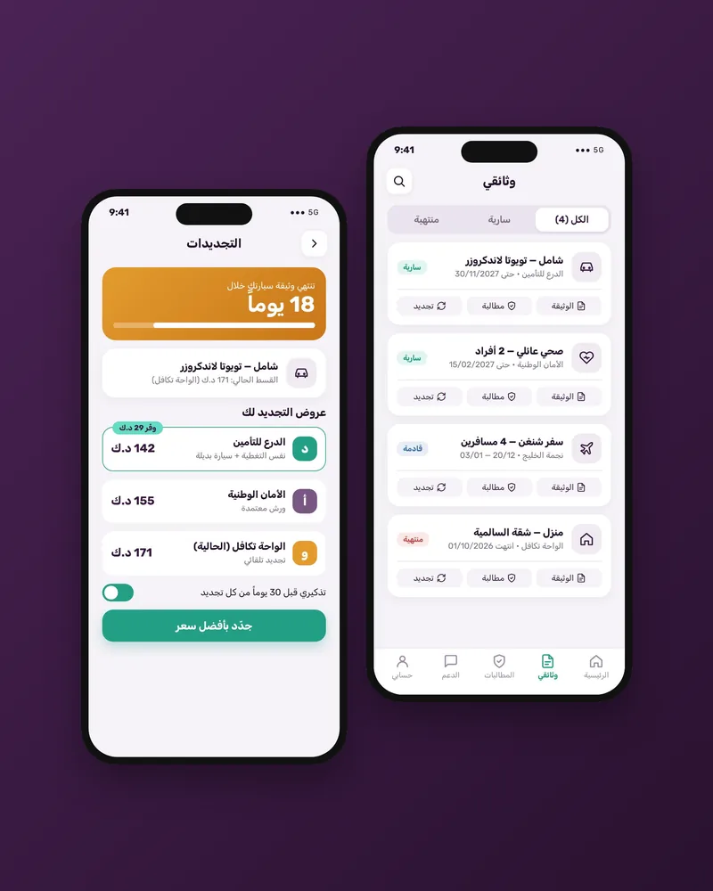
Documents and renewals 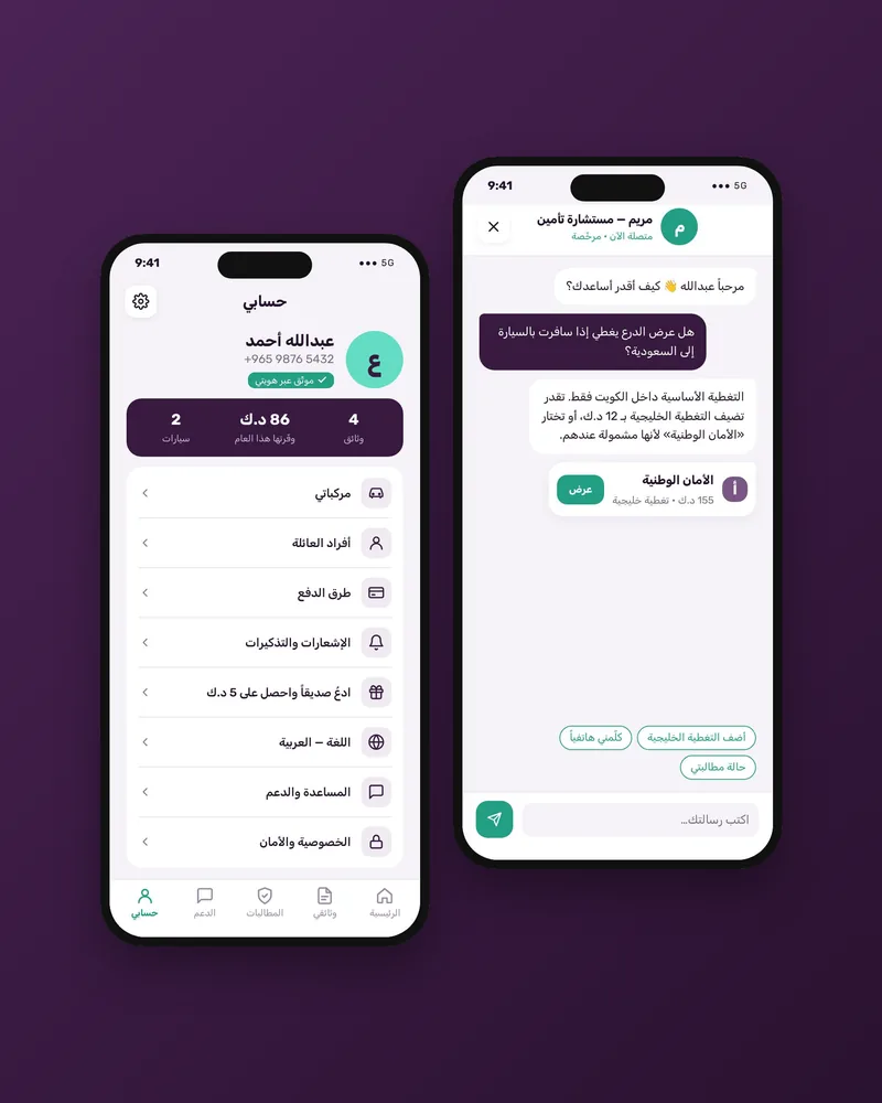
Chat and Account
06Results
No results are shown for this project.We publish figures only with the client’s written approval, and every figure carries a source, a period and an approval reference.A similar project?
Send your request and our team starts scoping it with you.